1upHealth
ROLE
Creative Director
SCOPE
Brand + GTM Strategy + Visual Language
Connecting Healthcare Through Data1upHealth is redefining how healthcare data is acquired, managed, shared, and computed.
While at Ruckus, I helped lead the company’s rebrand, working closely with the CEO and key stakeholders to clarify what 1upHealth stood for and how it should show up in the world.
The work established four core brand values—Human, Visionary, Bold and Resolute—and translated them into a visual identity designed to make a complex healthcare technology platform feel clearer, more approachable and more distinctive.
Creating the Visual LanguageThe identity was built around a simple idea: connecting the gap between healthcare and data.
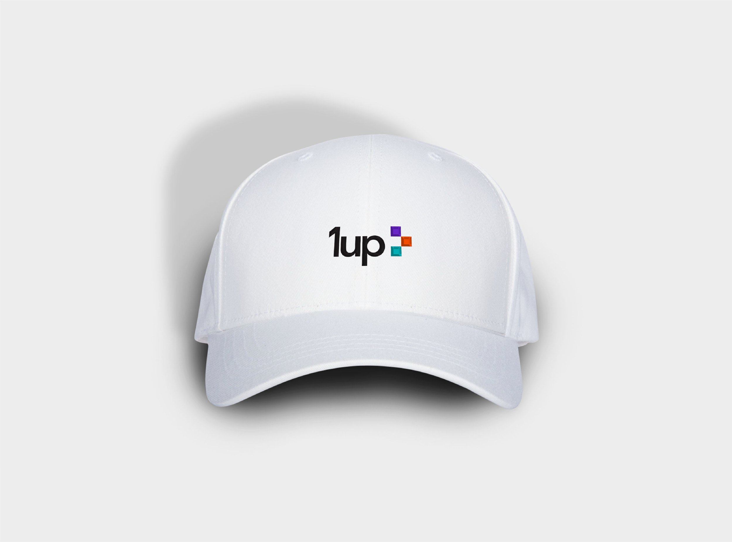
Inspired by the H in Health, three squares form a visual bridge between the two. Each represents a core function of the platform: Connect, Control and Compute.
The system was designed to work beyond the wordmark, becoming a flexible brand element that could function as an icon, graphic device, and foundation for the broader identity. A distinctive palette of purple, orange, and teal gave each part of the system its own role while creating a recognizable visual language for a complex category.





A Brand Built to MoveThe new identity gave 1upHealth a clearer, more confident presence in a complex and rapidly evolving healthcare technology landscape.
By translating the company’s capabilities into a simple, flexible visual system, the brand could communicate sophisticated technology in a way that felt human, approachable and distinct.
The identity created a foundation that could scale across everything from product and digital experiences to marketing, presentations and events—giving 1upHealth a recognizable voice as the company continued to grow.